Monday, July 30, 2012

Scrapbooking | New York Time's Square Scrapbook Layout Idea

Back in January of 2012, My husband and I spent two nights and three days up in New York City. While we were there we decided to walk down to Time's Square at night so that we could take in the sights, sounds and people of Time's Square. Wow, is that place packed at 10pm at night! (NOTE: You can click on the photo in this post to enlarge it so that you can see the particular details.).

My scrapbook layout today features 3 photos that we took while we were down in Time's Square of all of the neon lights, signage and people. This layout was done in the 12x12" sise and my color scheme was black, white, red and neon blue.

My background is a 12x12 sheet of black textured cardstock. On top of that I cut a piece that measures 8" square from white and black print paper. It looks like graph paper to me in regards to the print. I then inked around all 4 edges with black ink before placing it onto my background.

I slightly cropped down all three of my photos to measure the same size. I then matted all three of them onto one long strip of neon blue textured cardstock and left an 1/8" border around it. I then matted that strip onto textured dark red cardstock and trimmed again. I glued the photo strip down the right side of my background page.

I used my Cricut to cut out the letters to spell New York Square on the #1 size setting in a classic looking font. You can see where I placed the letters/words on my layout to serve as my title. I had a cardstock sticker of a vintage looking clock which I inked around the edges in black and then matted it onto neon blue, red and black cardstock, leaving an 1/8" edge around all mats. I took a silver marker and wrote the word "Time's" on that piece right above and to the left of the clock face. I then used 5 foam dots to place it onto my layout as I wanted it to be dimensional and raised up off of the page.

Underneath that I had a sticker of 2 ticket stubs and I decided to use them under the previously mentioned embellishment and I did my journaling on that in my own handwriting. It's hard to see on the picture above. In the top left corner I used a sticker that said "Snapshot Memories" which I matted onto neon blue, red and black cardstock leaving an 1/8" edge. I put it onto my background using foam dots. On the top left corner of that is a small sticker of a camera.

I wanted a clean and not too cluttered layout and I think I accomplished that. I also wanted a red, white and blue color scheme without it looking like July 4th so I think adding the black and making it the predominant color accomplished that too.

Friday, July 27, 2012

AstroBrights Back to School Crafts + Give a Brighter Year Sweepstakes

This is a partnered post written by me on behalf of Astrobrights Papers by Neenah Paper. All opinions are 100% mine.

How many of you use the AstroBrights papers in all or some of your paper crafting projects? Me! Okay, I admit, I love their papers and it's partly due to the fact that they come in 23 bright and fun colors! Not only that, they are a heavier weight of paper so they are the perfect paper to use in many of your paper crafting projects!

The AstroBrights papers can be used to make homemade business cards, pamphlets, brochures, in homemade greeting cards, scrapbook pages (spray with archival mist first), used in altering box projects and so much more! My granddaughter loves to use them when she colors, draws and does her homemade refrigerator artwork on them! We love the bright colors!

I wanted to tell you all about the "Give a Brighter Year" Sweepstakes that is going on right now and being sponsored by the great folks at AstroBrights! You can support your local Elementary School by entering and we all know how schools need our support this year. You can win cash prizes and the school of your choice can win up to $300,000 in much needed school supplies. Make sure you head on over to their web site to grab the details and to enter.

AstroBrights would love to have your participation in their design challenge and you can participate by creating something fun and unique using AstroBrights papers. When you share your designs and ideas on social media, you will want to hashtag your share/post with #goastrobrights so that they can find your posts!

I would love to know how many of you use AstroBrights papers? What kind of projects do you use them in? A few weeks ago we made some homemade pinwheels and used the brightly colored papers in our project. We are thinking about making some homemade paper kites (for toddlers of course) and will probably use the AstroBrights to make those. I love crafting with my grandkids and would love some paper crafting project ideas from my readers.

Please leave your thoughts and project ideas below in my blog's comment form. Thanks!

Wednesday, July 25, 2012

Scrapbooking | Montego Bay Waterpark Scrapbook Layout Idea

Last fall we spent a few days down in Wildwood New Jersey and went to the Montego Bay Indoor Waterpark and had a great time! The waterpark is not very big but there are 2 indoor slides and a large swimming pool to play in. This 12x12 layout features 4 photos I took that day while we were having fun at the waterpark. (Note: You can click on the photo in this post to enlarge it to see in better detail the layout I made).

The background is a printed sheet of 12x12 scrapbooking paper done in blues and in a block pattern which reminded me of pool water colors. I then took a piece of 12x12 blue cardstock and trimmed it down to measure 10" square. I used a navy blue ink and inked around all 4 edges. I placed this large square of cardstock onto my background sheet by putting lime green eyelets in each of the corners.

I cropped down 2 photos (the ones on the left) and rounded their corners. I then matted them onto medium blue and lime green cardstock. I only rounded the corners on the blue mat and left the regular corners on the lime green mat. The other 2 photos I cropped down to 3" diameter circles and matted them onto medium blue cardstock cut into a circle shape with an 1/8" border around each photo. I then matted those circles onto lime green cardstock and squared them off. You can see all photo placements in my photo.

I made my own journaling block out of lime green and medium blue cardstock and did my journaling in my own handwriting using a medium blue glitter pen. I then accented 2 corners on that journaling block with red flowers. In the top right corner of this layout I used a pack of Jolee stickers which consist of a red bikini and red/white stripped terry cloth towel.

There are some olive green rub-ons on the layout (small ones) that aren't showing up on my photo and they are just little swirls which I added to give more interest to the background. Between the 2 square/circle photos I made my own bubble embellishment. I took a round cardstock sticker that says SPLASH on it and inked around the edges. I then framed that with lime green cardstock and inked around the edges again. On top of the circle I placed one of those clear bubble pebbles and then stuck it onto my layout on the right side of those photos. I then used some olive green rub-on words that say "By The Sea, By The Sea, Beautiful Sea" in an arc fashion around the right side of that bubble embellishment.

There is a matching page to this layout which I will share with you all next week where my title block, bigger journaling block and 3 more photos are featured.

Friday, July 20, 2012

Scrapbooking | New York City Hotels Scrapbook Layout Idea

Back in January of 2012, My husband and I took a mini vacation trip up to New York City. We spent 2 nights and 3 days in the city and took in many of the attractions that New York City has to offer. (NOTE: You can click on the photos in this post to enlarge them to see the details).

While we were there we stayed in the Element by Westin Hotel which is an eco-friendly and "green" hotel. The decor is definitely pretty basic but yet nice and their color scheme is in neutrals. Keeping that in mind I knew that I wanted a basic scrapbook layout page done in neutral tones to reflect the feel of the hotel.

I did my layout in the 12x12" format size. My color scheme is 3 shades of gray. My background is a light gray textured piece of cardstock. I then took a piece of 12x12 gray weathered piece of scrapbooking paper and trimmed it down to 8" square. I used some silver metallic ink and inked around all 4 edges. I then glued it onto my layout centering it onto the background sheet.

I had 5 photos for this layout to squeeze onto the page. I trimmed down the 2 larger photos across the bottom and them matted them onto medium gray textured cardstock, trimming to leave a 1/4" edge. I then placed it across the bottom of my layout using glue dots. I had a photo of the Westin sign and I trimmed that down to match the height of those other 2 phots by 1 1/4" in width. I then matted that onto the medium gray textured cardstock and placed it on top of the other two but in between them as shown in my photograph.
The other 2 photographs I trimmed down too but in a much smaller scale. The photo of our champagne bucket and snacks was trimmed down to measure 3" by 4" in size and the photo of my hubby got trimmed down to 3" by 4" too. I matted them onto the medium gray textured cardstock and left a 1/4" border. See photo for placement onto the background.

I had the hotel's business card and sprayed it with some archival mist and placed it under the top left photo and just left the hotel name & logo sticking out. In the top right corner of the layout I placed 3 vacation themed 3-dimensional embellishments. I used rub-on wording that says "World Traveler" underneath the top left photo and to the left of the wording is another 3-dimensional embellishment that says Vacation with a tiny map underneath it.

My journaling was done on the matching/coordinating page to this one which I will share that layout with all of you in a few days. The title of this page is simply "New York City" and I used tile letters to spell that out along the bottom edge of the layout.

Overall I am very pleased with how this layout turned out. I wanted neutral color tones to match the hotel's decor and I wanted clean straight lines to match the hotel's design. I think I achieved that well with this layout which only took me about 40 minutes to make. Enjoy!

Tuesday, July 17, 2012

Join Martha Stewart at Apple's SoHo Store

Join Martha Stewart at the newly renovated Apple Store in SoHo on Wednesday, July 25, 2012 from 7-8pm EST time for a Q&A discussion about design, technology and her new creativity app
Experience the Martha Stewart CraftStudio app and print out your creations.

Where:

SoHo Apple Store Theater
103 Prince St., New York, NY 10012
Free Admission, Limited Space
RSVP to Jennifer Kung
jen@happy.is 516.776.2787

I really wish I lived in New York City and the surrounding area so that I could attend! I love Martha Stewart's craft products and own several of them! If you live in New York City hopefully you will get the chance to attend! Contact Jennifer for the invite and to RSVP! Good Luck!

Sunday, July 15, 2012

Quilt Pattern Selection For The Beginning Quilter

Quilt Pattern Selection For The Beginning Quilter
By Nancy S Ball

Whether you are from a family where several generations before you were experienced quilters, or whether you are the first in your family to take up quilting, you have no doubt seen pictures or patterns of quilts that you would enjoy making. If your goal is to create a quilt for yourself or as a gift for a special person, pattern selection for the beginning quilter is an important step in the process. By the time your project is completed, you will have invested many hours of your precious time. Here are a few steps to follow in selecting your quilt pattern:

o Above all, select a pattern that, when made into a finished project, you would be proud to keep and display in your home or give as a gift. There are thousands of patterns from which beginning quilters may chose. Just because something looks like it would be easy enough to make, does not necessarily mean you would want to make that particular quilt.

o There are several places you can search for quilt patterns. Internet searches will help you find free patterns. Quilting magazines available at most magazine stands or fabric stores contain patterns and are more economical than purchasing an entire book. Friends or family members are usually willing to share their patterns with you.

o Quilt pattern books are a good resource and are available at most stores where fabrics are sold. These books usually also contain valuable quilting tips, instructions and easy to follow diagrams. Usually when you purchase a book, it will contain several patterns you may want to eventually use.

o For your first quilting project, it is a good idea to select a pattern with larger blocks. In addition to being easier to make, this will help you finish your project quicker. If you find you enjoy making quilts, you can advance to more complicated projects.

o If you do not have a great deal of experience in sewing, you can still create a lovely quilt. Select a pattern that has only straight seams to sew. Stay away from the ones that have curved seams or difficult corner seams to put together.

o If you are an experienced seamstress and feel confident in your sewing ability, you have a wider variety of patterns you may want to consider. Sewing together a quilt top is very similar to other sewing projects you may have completed.

o When you find a quilt pattern you like, carefully read the sewing instructions and look at the diagrams given to assure yourself that you feel confident your level of sewing experience is adequate for the project you select.

For the beginning quilter, following the few simple guidelines in pattern selection will ensure that you enjoy working on your quilt during each step of the creation process. When you tie off the last stitch of your beautiful new quilt, you will have a handmade quilt that you will be proud to display or give as a gift to a special person in your life.

The author has had many years of experience in creating handmade quilts, including pattern selection, fabric selection, piecing quilt tops, as well as hand and machine quilting. A feeling of satisfaction and accomplishment awaits anyone who enters the creative world of quilting. Find quilting tips and information and the best quilting frames and supplies at http://www.bestquiltingsupplies.com/.

Monday, July 9, 2012

Baby's First Bath Scrapbook Layout Idea

My very first (and only) grandchild was born back on May 29th, 2009. She is the apple of our eyes and we just adore her! Little G got her very first bath at home on June 2nd, 2009 and I wanted to preserve that moment in time by scrapbooking a page about her first bath.

I did this page in the 12x12 format size. The background is a sheet of 12x12 scrapbooking paper in pale pink with 'baby girl' wording all over it in white. I then trimmed down a solid piece of pale pink cardstock to measure 8" square and attached it to the printed background with tiny white eyelets in each of the corners. I had one 4x6 photo that I wanted to use of Little G getting her first bath and framed it with a pretty floral printed sticker frame. I placed it onto the layout as shown in the photo above.

I had a slew of baby girl 3-d embellishments left-over from other projects and decided to use up a lot of those on this layout. The title of the layout is "Baby's 1st Bath" so I used chipboard embellishments to spell it out as shown in my photo above. I had a vellum quote that said "Rub a dub" and I framed that out with pale pink and medium pink cardstock. I then placed that at the bottom of the layout.
The rest of my 3-d embellishments on this layout include a glittered butterfly, a 2" by 2" piece of self-stick medium pink plastic mesh (under the bottom left corner of the photo), a round cardstock sticker that says Baby's First Bath with a sticker of a yellow rubber duckie), the word BABY cardstock sticker is under the photo and finally, I used 3 tiny pink satin ribbon bows on the layout. You can see the placement of all of these embellishments in the photo.

I decided to do all my journaling on the backside of the page (yes, you can journal on the back of your pages) because I really had a lot to say about the day I helped my daughter give little G her very first bath. Sigh...they grow up way too quickly!


The Revlon Expression Experiment and My Results

This is a partnered post written by me on behalf of Revlon. All opinions are 100% mine.

Normally I don't post about cosmetics and makeup here on my blog but today, I wanted to do something a little different. As a work at home and home business owner, I often don't get all-dolled up just to work from home. I was also finding myself in a "rut" and doing the same-old look every time I put my makeup on.

I was asked to participate in the Revlon Expression Experiment and jumped at the chance! As a woman who just turned 45 years old, I needed a new look and some help accomplishing it. The great folks over at Revlon sent me their Revlon Expression Experiment Kit and inside it I received a very helpful instructional booklet with a variety of looks for to me to choose from, along with a 3-piece nail polish set, 2 lipstick, 1 lip gloss, makeup primer and 2 nice palettes of eye shadow. Wow, lots of goodies to play with!

What I really like about the products that Revlon sent to me is that the kit included almost everything I needed to change-up my look (minus mascara and eyeliner). With the summer heat we have been experiencing here on the east coast, I was rarely even wearing makeup as it felt heavy on my face or ran/melted in the heat. I was excited to try out the Revlon products as my adult daughter raves about them to me all of the time.

Revlon is a great company for empowering women because their products are high-quality, vast in the colors and variety of products and I love that they are all affordable. These days, I want product that delivery performance and I want them at a price that fits within my budget. If you are like me, Revlon is the answer!

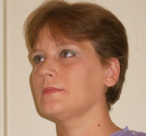
Note: Some of the photos in this post will have a yellow tint due to the special lighting I have in my bathroom. The photo to the left shows me just with both primer's on...no other makeup. Please don't scream, I don't look good without makeup!

After my shower I decided to try out the Revlon Photoready Perfecting Primer. I usually don't use a primer but after applying the Revlon one, I will now be a faithful primer user. The primer just glides across your skin and it doesn't clump up or feel heavy at all. I have dark circles under my eyes so I added the Revlon Photoready Eye Primer + Brightener underneath my eyes and onto my eye lids. I did have some problems using this product because it's in a tube that you twist to get the product to come up and into the application brush. I had to click and turn it about 20 times before it finally loaded into the application brush. Once it did, I applied it and then smoothed it underneath my eyes and on my eye lids with my fingertips. (I found that to be better than the brush). It did a wonderful job at lightening my dark circles and it made eye shadow application easier.

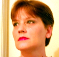
I then decided to use the Revlon "Inspire" Eye Shadow Compact for my eyes which includes 4 different colors of eye shadows. On the back of the compact they have a diagram where each of the 4 colors go on your eyes so I followed that and applied all 4 of them. (one is a mint green, one is a turquoise, one is an ivory and one is a dark gray). I found the eye shadows to be fabulous and very easy to apply. They didn't clump up, didn't get all over my eye lashes or smear during the application process. I admit, I normally do not wear colors like these day-to-day but I would certainly wear them to go out at night. With that said, using this compact made me feel like I needed to change up my daytime look and since I have green eyes, the green eye shadows really brought out the green in my eyes. If you have green eyes, the "Inspire" compact is a must! In addition, I applied them at 7am in the morning and they were still going strong at 7pm later that night! yeah! Eye Shadows with staying power! You gotta love that! The photo to the right is my new "Daytime Look" and I think it looks fabulous!!!!

I normally do not wear lipstick or lip gloss unless it is for a special ocassion or an evening out with hubby (aka. date night with my hubby). Usually lipsticks and lip glosses bug me as I usually need to keep reapplying them numerous times during the day. With that said, I love lip glosses that are not sticky but often times it is really hard trying to find them.

Revlon sent me a lip gloss that is in medium shade of red, with an orange under-tone to it. When I first saw it, I thought ewwww, that shade is NOT for me! However, I was willing to try a new lip gloss and in a shade I would normally stay clear of. The lip gloss has your classic foam tip applicator and is really easy to use. I put it onto my lips and only had to coat my lips once as it gives you great coverage. I didn't need to use any type of undercoat or lip liner with it. What was really nice about this lip gloss other than the coverage is that it was NOT sticky! You didn't feel like your lips were sticking together. In addition, I wouldn't normally buy this shade but now that I tried this shade of red, I think I looked pretty good in it! hahaha! I definitely need to rethink red lip gloss for the future! (side note: hubby loved the red lip gloss on me!).

The photo on the left is my new evening-time look! I used the Revlon Face Primer, Eye Primer, the Bombshell Eye Shadow Compact (medium gray, dark gray, yellow and ivory eye shadow colors) and the red lip gloss that I just told you about.

I am having a LOT of fun with my new Revlon Expressions Experiment Kit and trying out all kinds of colors and looks that I normally wouldn't of tried. I love that Revlon has something for everyone in the cosmetics lineup. You can go for the classic neutral shades, pastel shades or go for the bold and daring shades. Another great thing is that Revlon's cosmetics are ageless! My 27 year old daughter can wear them, I (at age 45) can wear them and even my 66 year old mother can wear them! yeah!!!

Revlon also sent me a 3-piece nail set including: a base coat, a pretty creamsicle orange nail polish and a clear top coat. I didn't get time to play with that just yet but I am thinking about putting it on my toes! I love fun and funky colors like that on my toes during the summer when I am wearing a lot of open-toed sandals and/or going barefoot. How about you? Like the fun & funky shades on your toes in the summer?

I would love for my readers to join the Revlon Expression Experiment Facebook Application over on Facebook! It is a lot of fun and will give you a LOT of ideas on how you can get out of your makeup rut and get a new look! Yes ladies, you can do these fun makeup looks all by yourself and do it all in the comfort of your own home!

Do any of you love Revlon cosmetics? If so, what are some of your favorite products? I would love to hear about your makeup look and how you will be changing up your look this hot & steamy summer of 2012! Please feel free to leave me some comments below. I love to hear from my readers!


Thursday, July 5, 2012

Scrapbooking | Cape May Beach Vacation Scrapbook Layout

Back in early June my husband and I took a 1 week vacation down to the south Jersey Shore. We stayed in North Wildwood but spent one afternoon down in Cape May visiting some of their landmarks and tourist attractions. We saw the World War II Lookout Tower, the All Veterans Memorial and the Shipwreck of the Concrete Ship Atlantis. All of these attractions are located on Sunset Beach in Cape May.

I wanted to do a 12x12 scrapbook layout of 3 photos from our afternoon. I only cropped them slightly as I wanted to maintain everything that we saw in the photos. I then matted them onto solid white cardstock and left an 1/8" edge and then matted them onto medium blue cardstock and left a 1/4" edge. I then inked around the edges of the blue mat using a dark blue ink.
My background is made up of 2 sheets of paper. The bottom sheet is a pale blue with a white cross-hatch print (it's a very light print) and the accent strip of paper is a muted blue, pale green and white swirl print paper which I trimmed down to measure 5 1/2" by 12" in size. I inked around all 4 edges of the accent strip of paper and then glued it onto my background sheet (off centered). The colors and swirls on the accent strip reminded me of waves and the beach for some reason so that is why I selected that.

You can see in my photos where I placed my 3 photographs, 2 are horizontal and 1 is vertical. All of the accents and embellishments on this layout are from K & Company and are part of the Tim Coffey line. I love his seagull tag so I placed that near the top right. I didn't want my journaling to show through the window as I love the gull and the print on that tag so I did my journaling on the back of the tag. I used some of his chipboard letters to spell out CAPE MAY (top right). I accented 3 of my corners with small clam shell that have glitter applied to them and placed 3 sea shells between the 2 photos on the right. I wanted to incorporate sea shells into the layout as hubby and I collected some shells from Sunset Beach.

While we were on the beach there was a guy fishing and he showed us a fish he caught (hence the Tim Coffey fish under the left photo) which I put onto the page using foam dots to give it some dimension. In addition, we threw some bread out onto the beach for the sea gulls so it was important to have gulls on the page too so I placed a Tim Coffey Sea Gull chipboard embellishment on the bottom right photo.

I like clean and uncluttered layouts and I think I accomplished that with this particular layout. In addition, I didn't want to crop down my photos too much as I really like the scenery in them.

Tuesday, July 3, 2012

Scrapbooking Family Reunion Scrapbook Layout Idea

A few weeks ago my great auntie handed me a box full of old family photos and asked me to make her a scrapbook using the photos. I have finally started that project and today I am sharing the first layout that I made. This layout features photos from 2002 when my auntie hosted a family reunion. She only had 3 photos from the family reunion so I decided to use all 3 in the layout. This layout is done in the 12x12 format. You can click on the photo to enlarge it to see the details better.

My aunt's 2 favorite colors are blue and pink so I decided to do the layout in various blues, pinks and white. The background is a sheet of 12x12 printed cardstock done in light blue with an allover floral & vine print in white. It's really a subtle print. I used a piece of vellum for my title block that says "Family Reunion - Cousins, Sisters and Buds" printed on it and framed it up with navy blue and white cardstock. To add a little bling to it I added 2 pink stick-on rhinestones for the dots in the I's. I then accented the right side of the title block with a 3-dimensional flower from a K & Company embellishment pack. To the right of the title block is an oval tag that I made and I wrote the year 2002 on it and then affixed it to the page using 2 light blue brads.

I cropped 2 of the photos down into rectangular shapes and rounded the corners. I then matted them onto white and navy blue cardstock. For the third photo I cropped it down into a smaller rectangle shape and matted it to match the other two photos. To the left of the two photos on the left I used a pink cardstock bracket to add some pink color on that side of the page to balance out the color. In the bottom right corner I added 4 cardstock 3-dimenional flowers from a K & Company embellishment pack.

I did my journaling on 3 small tags which I attached to the right side of each photo with a light blue brad. I simply wrote the family members names onto the tags as I didn't know much about this family reunion since I wasn't in attendance. Thankfully, I knew who everyone was in the photos which was a good thing! So journaling on this layout was pretty limited.

As I work on layouts from my aunt's photo stash, I will share some more layouts here on my blog. I will be challenging myself to do some layouts using old black & white photos from the 40's through the late 60's so I need hit the scrap store for some supplies! Enjoy!

Monday, July 2, 2012

Win a Trip to LEGOLAND in Florida Sweepstakes!

This is a partnered post written by me on behalf of Atlantic Luggage. All opinions are 100% mine.

Have you ever visited LEGOLAND in Florida yet? Are you and your family looking for something cool to do this summer? Well, I have some great news for all of you! Right now there is a big sweepstakes going that is being sponsored by Atlantic Luggage and LEGOLAND!

You can enter the Atlantic Luggage and Legoland Sweepstakes today and then keep your finger's crossed that you end up a winner. What does the winner get you might ask? Well, I am going to tell you!

One lucky winner is going to win a 2-day vacation for 2 adults & 2 children to Florida! This vacation package includes one hotel room for two nights, a car voucher, a Meet & Greet with LEGOLAND Master Model Builder and a brand new set of Atlantic Luggage! Wow, what a cool prize package!

The great folks over at Atlantic Luggage are sponsoring this fabulous sweepstakes and if you have never seen their luggage products, you are really missing out! Their luggage is stylish, durabe, well-made and super affordable! Great luggage for the vacation traveler or the business traveler! They have a ton of styles and designs to choose from so there is definitely something for everyone!

LEGOLAND in Florida recently added a brand new waterpark which opened in May of 2012 and people have been flocking to it since! It features a wave pool, tube slides and body slides. Your family can also design and build a unique LEGO vessel and then have fun setting it afloat on the 1,000 foot lazy river. I love floating around on lazy rivers and splashing down some fun water slides!

My grand daughter has been wanting for us to take her to LEGOLAND so I will be entering the Sweepstakes too! Head on over there today and enter...you never know, you could end up being the Grand Prize Winner! Good Luck!